Tuesday, November 23, 2021

EYEDROPPER IN POWERPOINT PRESENTATION


THE MAGIC OF USING EYEDROPPER IN YOUR PRESENTATION


Todays post is about eyedropper we have been using PowerPoint color palette for changing the color of text, object or shape, you can try this eyedropper tool and give color of your choice to the text, object or shape. It is nothing difficult to learn about this tool you all will really like this tool. This tool brings the sparkle to your presentation.

If you want your presentation to be  attractive, don't underestimate the importance of making all the colors compatible and coherent. That's exactly the case when the PowerPoint Eyedropper tool can come in handy. 

What is the Eyedropper tool in PowerPoint?

Paper colorful.

An Eyedropper is an option that allows picking a specific color from anywhere in PowerPoint, or outside of it, and adding the chosen color to your presentation. Thanks to Eyedropper it is possible to match colors of shapes, objects, backgrounds, and texts throughout the slides and make them look coherent.

Let's say you want the background on all of your slides to be the same color as the leaves shown in a photo on the first slide. What are the odds that you will be able to find this exact color among the color options presented in the PowerPoint color palette generator? We're not telling you that it is not impossible; however, to do so, you will have to spend a great deal of precious time trying to find the nearest match. There's no need in wasting time with such a task since PowerPoint has already taken care of everything for you. With the Eyedropper tool, you can copy and transfer any color to the background in no time. And there you go! The background color on all the slides matches those leaves from the first slide.

Where do you find the Eyedropper?

Ok, where is the Eyedropper tool located in PowerPoint? The Eyedropper tool can be found in the 2013 and 2016 versions of PowerPoint and in Office 365. It is worth mentioning that you won’t be able to use the eyedropper option in Touch mode since it is only available if you have a stylus or mouse.

The Eyedropper option can be found among any drop-down menu that is used for changing a color whether it is a shape outline, a text block color, or a background fill. If you need to change the color of a shape, first select a shape, navigate to the Format tab on the Ribbon, click on “Shape Fill” and choose “Eyedropper.” However, there's an easier way to find the eyedropper. You will see this option is in the menu after you have selected a text block, a shape, or a background you need a matching color for and right-clicked on it


Learn How to Use the Eyedropper 

If you haven’t used the Eyedropper tool before, you will be amazed at how useful it can be. 


The video will help you out to use the eyedropper tool to make your presentation look attractive.

Monday, November 22, 2021

TO CREATE INFOGRAPHICS IN POWERPOINT AND ITS EDUCATIONAL PURPOSE

INFOGRAPHICS


If you want to uncover the different facets of a theory, it is better to use an image to display its various components. 

Today its all about infographic which is a visual representation of your content which your learners will be benefited with. 

What is an infographic?

An infographic is a collection of imagery, data visualizations like pie charts and bar graphs, and minimal text that gives an easy-to-understand overview of a topic.

Infographics can be incredibly effective educational tools, thanks to their ability to break complex information into easy-to-understand components and to make even dense data engaging. Discover why visual content is so effective in an educational context and learn how to design and use infographics for education.

Why Infographics Are So Effective in Educational 

Contexts

No matter what type of information you want to teach, there’s a good chance that written or verbal instruction alone won’t get your message across. After all, not everyone can process language efficiently, and the average person is more apt to forget written or verbal communication than visual information. In fact, most people retain just 10 percent of what they hear and 20 percent of what they read, while they remember 80 percent of what they see.

 Since approximately 65 percent of people are visual learners , adding image-based components to your teaching materials is a smart choice.

Infographics often prove so effective in educational contexts because they use imagery to highlight, explain, or enhance text-based information. They have the unique ability to capture attention, convey information, and encourage data retention despite their complex nature. 

Two Ways Students Can Benefit From Infographics.

1. Introducing a Unit

Make Equation Cheat Sheet Infographics

Sometimes before starting a new unit in math, a teacher might provide students with a card or sheet of paper that contains all the important formulas they will be learning and using during the next few weeks. 

Using infographics ensures that students start off on as equal footing as you can provide.

Example Infographics for Introducing a Unit:

  • Timeline of events for your history unit
  • Background information for a novel or short story
  • Key terms and formulas for science
  • Most common homophones
  • Punctuation reference sheet
  • Key figures for the unit
  • Important mathematical formulas
  • Verb conjugation endings
  • Sentence structures

Once you've created your amazing infographics, you can include it in the beginning of your PowerPoint presentation, send it out to your students through Storyboard That (or your classroom management system), or print it and pass it out to students at the start of the class.

2. Summarizing a Unit

The Odyssey Summary Infographic

Infographics can be created after a unit as well, to provide students with a summary of key information. Many of the examples listed above can also fit into this category as well. This will also help students prepare for final exams, since they'll have something to use as a starting point for studying. These takeaways won't include every detail, so students should still pay attention and take notes during the class.

Incorporate Infographics Into Learning Activities

Introducing your class to examples of great infographics is a smart way to use visual content in your lesson plans. Not only can this type of visual content increase student interest and engagement, but infographics can also help students learn about important topics ranging from history and literature to math and science. Depending on the focus of your classroom and the level of your students, you could use infographics in a number of learning activities.

  • Try introducing a new module by using an eye-catching infographic to convey the basics or generate interest.
  • Encourage students to read statistics, interpret data, and draw conclusions from an infographic.
  • Rather than having students read a textbook passage or a news article, use an infographic to start a discussion or lead a classroom debate.


How to Design Infographics for Education


This video will help you to make an infographic for your topic.

Sunday, November 21, 2021

WAYS TO MAKE PRESENTATION SLIDE EFFECTIVE

 TIPS TO CREATE PRESENTATION SLIDES


Today it is about how the teachers can design their slides by following the guidelines of the slide design to keep their learner engaging. As the above quote also suggest presentation is all about the people so we need to make sure our message is conveyed to them as if they are not able to see the slides properly then what will be the use to make a presentation.


Presentation design is important because with it, you can envelop your ideas, narrative, visuals, data and statistics all into one place and tell a compelling story that leads your learner's to the conclusion you want them to reach. 

With proper presentation design, you can tell your story clearly, inspire your learner to take your next steps and have them engaged with what you’re saying all the way through.

This points will help you prepare the next presentation for your learner's.


1.   Don’t Use More than 6 Lines of Text

powerpoint_good_bad

Packing too much information into a slide will completely undermine its purpose. Remember: The learner often has to process everything you say while they view the slide.


2. Ditch the Bullet Points

powerpoint_good_bad2Too many presentations are bullet point crazy. No one will remember 10 bullet points, but they will remember 10 compelling slides. Use each slide to build your case and incrementally tell your story. Divide each bullet point into subtopics it will help the learners to retain the information also.

3. Use Single Images

powerpoint_good_bad8Images help make your presentation more visual, but don’t get carried away with too many on one slide. It’s a presentation, not a photo album. Limit your designs to a single image with simple or no text. 

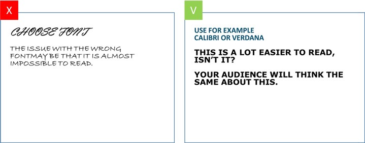
4. Choose the right font


Choosing fonts for presentations

Try and pick a classic font instead of a creative one. Picking the wrong font can easily cause your text to be unreadable for your learner. Verdana, Calibri and Helvetica, Sans Serif for example, are all safe choices. 


5. Size Fonts Appropriately

powerpoint_good_bad4Chances are you’re designing your presentation on a laptop—and that’s a much different size than the final presentation screen. When sizing your fonts, keep in mind that the text should be large enough to be read by the person in the back of the room.

6. Contrast

powerpoint_good_bad5

Besides the looks and size of your font, it is important to take contrast into account. If you’re using text on a photo, make sure that your font is readable by either placing a border or casting a shadow around it. Use white color for black background and black color for white background.

7. Solely use basic coloring

powerpoint_good_bad6

Colors are often used to give the slide some ‘flair’. When picking colors it is important to define your learner and the purpose of the presentation. It’s good to use vibrant colors in a presentation for a primary school. However, when in a formal setting, you will have to define your colors based on your target audience.


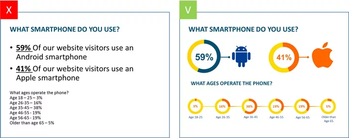
8. Showing data on your slide? Visualize these as much as possible

Using visuals on slides

Whenever your presentation contains a lot of data, it might be easier to communicate this data by using visuals instead of just using text. Graphs might give you the results you are looking for. PowerPoint offers a wide variety of graphs.


Saturday, November 20, 2021

HOW TO CREATE AN EFFECTIVE POWERPOINT PRESENTATION


TO CREATE EFFECTIVE PRESENTATION


The best PowerPoint presentations shouldn’t be remembered. Instead, they should fall into the background to support you and the message you’re trying to get across. So that your learners could take up the points which you have explained in the presentation. But by simply making it and putting all the contents without any guidelines will not serve your purpose. So make sure you know the guidelines before making a presentation for your learners and yourself too.

This video will take you from finding your initial topic to learning how to make an effective PowerPoint presentation. 

This not only help your learners active participation but also give them a reason to see the Powerpoint.

The video provided below will help you to make your presentation effective.


Friday, November 19, 2021

HOW TO MAKE YOUR POWERPOINT PRESENTATION MORE INTERACTIVE

9 WAYS TO MAKE YOUR PRESENTATION INTERACTIVE. 


During this pandemic time there was a shift in the learning pattern from offline to online during this online mode of learning most of the teacher's used PowerPoint presentation to teach their students but to make an online learning more interactive as we did in the offline mode they can look at these ways to grab the attention of the learner as well as having a active communication.

When you’re putting together a presentation, you want it to be engaging, so that your learners will interact with the class and the learning will happen in a more better way.

The best way to do that is by creating an interactive presentation that holds learners attention and even allows them to participate.

Sitting in a boring presentation where the teacher simply talks at their learners can make eyes glaze over and cause the teacher to lose their listener.

Adding interactivity into your presentation is the best way to spice up your speech, engage your learners.

With these 9 ways to create an interactive presentation, you’ll be sure to grab your learner's attention and keep them attentive throughout the entire presentation.


1. Start your interactive presentation with an icebreaker.

The first step is creating a rapport with your learner. Put together a fun icebreaker game. Here are just a few icebreaker games 

2. Use video clips in a slide or two.

You don’t have to be the only one talking during your presentation. Embed a video into one of your slides to switch up your learner's focus.

With PowerPoint  you can easily embed a YouTube or a video you have created video into your slide for your learner's to view on their own or for you to feature during your presentation. Here's how you can do that. Insert > Video > Online Video or Video On My PC


3. Have a Reflection Spot.

Want to get the learner involved? Ask them questions!

While many teacher's always plan to host a question round at the end of their presentation for the learners to ask the question, it can go both ways.

You can easily put together a few slides where you’re asking your learner questions throughout your presentation. Before you move onto the next section, ask your learner's what they think first.


4. Create an interactive quiz.

Take it a step further and actually create a quiz in your interactive presentation. This works well for both live and embedded presentations.

You can paste the link of the quiz you have created in the chat box so that the learner's can link into. So ask your learner's a question, gather their answers and then click to expose the correct answer. Here are some sites which you can create quiz.15+ Best Online Quiz Makers Tools & Apps in 2021 (Free & Paid .

5. Poll your learner's.

Another great way to get your learners involved in your presentation is to poll them. Give them multiple choice options to see which one is the most popular. Ask them to raise hands.

You can even use a polling software and have your learner input their answers via their laptop or smartphones and watch the results come in live on your screen.

Have fun with it. Ask your learner their favorite football team, which ice cream flavor they’d choose between vanilla and chocolate and more. This is a great way to do icebreakers, as well as break up your presentation with some mindless fun.

Of course, you can also have polls relevant to your presentation topic. Consider all of the ways you can use a poll in your next interactive presentation.


6. Include discussion questions.

Depending on your presentation, consider adding discussion questions in. You can break your students up into small groups to talk about your questions or simply have them discuss it briefly with their batchmates. 

This creates an interactive environment with very little effort on your part. In online setting you can use breakout rooms to have the student-student interaction.

7. Get your learners ask questions.

Several times throughout your presentation, take a pause to ask for learner's questions. Allow your learner's to ask questions about the slides you’ve already covered and the ones that may be coming up.

Getting your learner's to ask questions, and letting them know that there will be several opportunities to do so, is a great way to ensure they continue to pay attention, take notes and write down potential questions throughout. 

8. Use data visualization in your interactive presentation.

Last, but certainly not least, use data visualization to showcase your information in an engaging and easy-to-understand format. Data visualization can be anything from a chart or graph that visually represent actual statistics and numbers to an icon or graphic that represents words.

Visualizing your points can be a great way to argue your point, and creating charts, graphs and other figures helps your learner's digest your content that much quicker and more easily.

9. Use  Of Animations

If you’re presenting key data, try to visualize it instead of leaving it solely in table form, and add animations where appropriate. You can animate your charts directly in PowerPoint using the Animations > Animation Pane tab. The video will help you out to add animation to the objects.


EYEDROPPER IN POWERPOINT PRESENTATION

  THE MAGIC OF USING EYEDROPPER IN YOUR PRESENTATION Todays post is about eyedropper we have been using PowerPoint color palette for changin...