TIPS TO CREATE PRESENTATION SLIDES
Today it is about how the teachers can design their slides by following the guidelines of the slide design to keep their learner engaging. As the above quote also suggest presentation is all about the people so we need to make sure our message is conveyed to them as if they are not able to see the slides properly then what will be the use to make a presentation.
Presentation design is important because with it, you can envelop your ideas, narrative, visuals, data and statistics all into one place and tell a compelling story that leads your learner's to the conclusion you want them to reach.
With proper presentation design, you can tell your story clearly, inspire your learner to take your next steps and have them engaged with what you’re saying all the way through.
This points will help you prepare the next presentation for your learner's.
1. Don’t Use More than 6 Lines of Text

Packing too much information into a slide will completely undermine its purpose. Remember: The learner often has to process everything you say while they view the slide.
2. Ditch the Bullet Points

3. Use Single Images

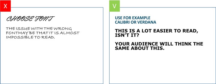
4. Choose the right font
Try and pick a classic font instead of a creative one. Picking the wrong font can easily cause your text to be unreadable for your learner. Verdana, Calibri and Helvetica, Sans Serif for example, are all safe choices.
5. Size Fonts Appropriately

6. Contrast
Besides the looks and size of your font, it is important to take contrast into account. If you’re using text on a photo, make sure that your font is readable by either placing a border or casting a shadow around it. Use white color for black background and black color for white background.
7. Solely use basic coloring

Colors are often used to give the slide some ‘flair’. When picking colors it is important to define your learner and the purpose of the presentation. It’s good to use vibrant colors in a presentation for a primary school. However, when in a formal setting, you will have to define your colors based on your target audience.
8. Showing data on your slide? Visualize these as much as possible
Whenever your presentation contains a lot of data, it might be easier to communicate this data by using visuals instead of just using text. Graphs might give you the results you are looking for. PowerPoint offers a wide variety of graphs.


Wow..u elaborated the things very precisely with images which is very useful.
ReplyDeleteThank you
DeleteUseful content 👌
ReplyDeleteThe post is very interesting. It is always nice to give examples and explain. It helps reader to comprehend better.
ReplyDeleteVery useful for beginners
ReplyDeleteThank you
Delete